Web Design

Marmot Baby

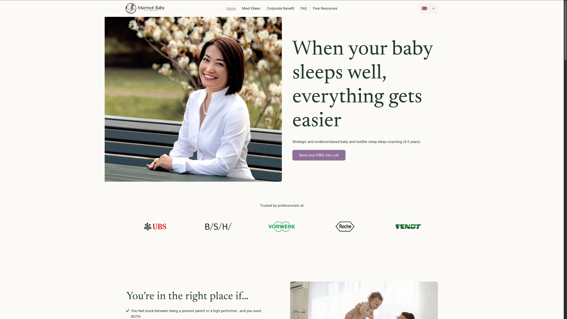
A premium website for a premium, bilingual baby sleep consultancy

Eileen had just recently started her baby sleep consulting business. She signed up for Wix and tried to build her first website on her own. After several iterations, she realized that creating a premium-looking, high-converting website for a high-touch service was harder than expected.

She approached me with two main questions:
“How do I position myself so that the right parents find me?”
“And how can my website reflect the premium, calm, and empathetic experience I want to offer?”

Screenshot of Marmot Baby Sleep Consulting website
My role

I worked with the founder, Eileen, as a strategic partner for her digital presence and positioning. The work went far beyond „just a website“ and included brand, messaging, and offer design.

Responsibilities
  • Clarified business goals, ICP, and value proposition
  • Defined the site architecture and key user journeys for stressed, time-poor parents
  • Developed the visual identity (color palette, typography, imagery) based on an alpine brand theme
  • Designed and built a multilingual website (EN/DE) in Wix, including ~20 pages
  • Co-created a new B2B corporate benefit offering and integrated it into the site structure and messaging
Tools
Figma
Wix Studio
Affinity Suite
Canva
Technologies & Methodologies
UX strategy
Responsive web design
Information architecture
WCAG 2
Content strategy
SEO
Style guide

Challenge

Eileen offers a premium 1:1 consultation service for high-performing parents who do not want to choose between family and career. Her clients are often exhausted, short on time, and overwhelmed by conflicting sleep advice.

The initial situation:

  • No experience with web design or UX
  • A self-built Wix prototype that did not reflect the quality of her service
  • A strong offer in her head, but no clear structure, messaging, or ICP on the website

We needed to:

  • Translate her expertise and empathy into a clear, credible positioning
  • Build a website that feels calm and trustworthy, but still convinces and converts
  • Speak to two audiences over time: individual parents and companies offering sleep coaching as a corporate benefit

Design process

Understanding the business and the audience

Before touching layouts, we focused on strategy. Together, we:

  • Conducted competitor research to map the baby sleep consulting landscape
  • Did a short SWOT analysis to identify Marmot Baby’s strengths and differentiation
  • Created an Ideal Customer Profile (ICP) for working parents in demanding jobs
  • Identified core questions and objections parents have before booking a call

This gave us a clear basis for:

  • Site structure
  • Page hierarchy
  • Messaging and CTAs

Brand and visual direction

Marmot Baby Sleep Consulting is based near the Alps and wanted to use an alpine theme as part of its brand identity. We used this as the visual anchor to convey calm, nature, and stability.

I created a color palette that reflects this:

  • Warm, natural, earthy hues as a base
  • A distinctive purple CTA color inspired by alpine crocus, already present in the logo

On this basis, I defined:

  • Typography hierarchy for headings, body text, and accents
  • Rules for imagery (tone, framing, color usage)
  • Basic spacing and component rules, so we could later scale the site in a design-system-like fashion

Information architecture and page flows

The homepage and overall structure had to do two things at once:

  1. Give exhausted parents a very quick understanding of what Eileen offers and whether it fits their situation.
  2. Build enough trust to book a 1:1 call or download a lead magnet.

I therefore:

  • Defined the navigation and page structure for ~20 pages
  • Structured the homepage as a clear storyline: Problem & empathy → What Marmot Baby offers → How it works → Social proof → CTA
  • Implemented a booking calendar to book a free consultation

Throughout, we focused on simple language and low cognitive load, matching the reality of sleep-deprived visitors.

Expanding into B2B: a new corporate benefit

While Marmot Baby initially targeted only individual parents, Eileen’s positioning opened the door for a second track: sleep consulting as a corporate benefit. I identified the opportunity to position Marmot Baby as a high-impact, low-cost benefit for employers

After several strategy sessions, I:

  • Helped shape a concrete offer for companies (scope, format, and outcomes)
  • Integrated this offer into the website via a dedicated B2B section with tailored messaging for HR and leadership audiences and clear CTAs for corporate enquiries

This work effectively opened a new potential revenue stream with high-ticket clients.

Outcome and learnings

Impact

  • The new website clearly sets Marmot Baby apart from other providers and positions it as a premium, empathetic, and science-informed service
  • The clearer positioning and ICP-aligned messaging led to more leads that matched the ideal client profile and therefore higher conversion rates
  • A consistent brand style guide and component logic helped Marmot Baby stay visually and verbally consistent across other marketing channels (social media, outreach, presentations)
  • The newly created corporate benefit offering generated strong interest from companies, opening up a completely new income stream with high-ticket B2B clients

The project is ongoing, and we still refine the site based on analytics and user feedback.

What I learned as a designer

  • Even for a “simple website”, starting with business strategy and ICP leads to better design decisions and higher-quality leads
  • Translating an emotionally sensitive service like baby sleep consulting into a digital experience requires a careful balance of empathy, clarity, and persuasion
  • Combining B2C and B2B on one site is possible, but it demands crisp navigation and differentiated messaging to avoid confusion

See for yourself

< Back to home