Tools
Sketch
InVision Studio
Whimsical
Technologies & Methodologies
User flow
Wireframing
Prototyping
Interface design
Style guide
This project was created as part of my UI specialization course at the online boot camp CareerFoundry. The objective was to create a responsive web app that provides property buyers with information on properties of interest.
UI designer
8 weeks
Real estate investment is an increasingly popular way for individuals to achieve financial security. It is an exciting and emotional experience, but often complicated. While there are plenty of blogs and agencies providing information, often, buyers new to the market may struggle to get started without professional guidance and waste time viewing properties out of their range. This web app will provide them with the expertise needed to get started efficiently.
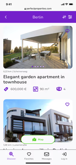
Perfect Properties is designed to make it easier for first-time buyers to find a suitable property and provide them with the information they need to invest with confidence.
To make this possible, the look and feel at Perfect Properties will focus on a clean, quick, and smart style. After all, the key message of Perfect Properties is: “Finding the perfect property shouldn’t be hard”
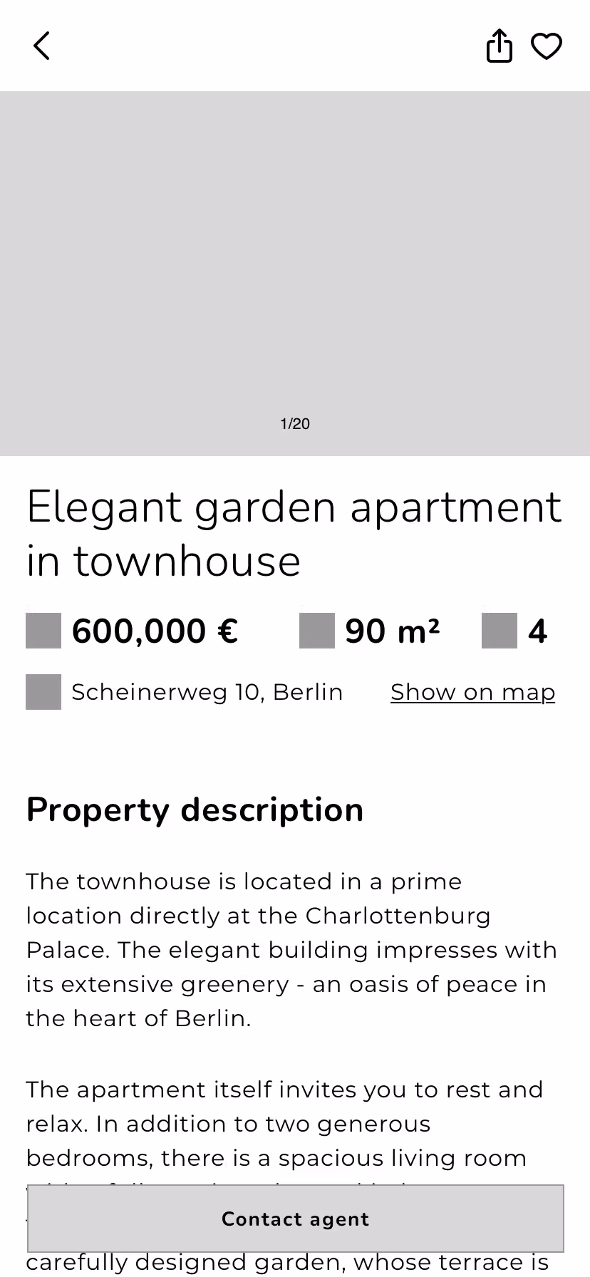
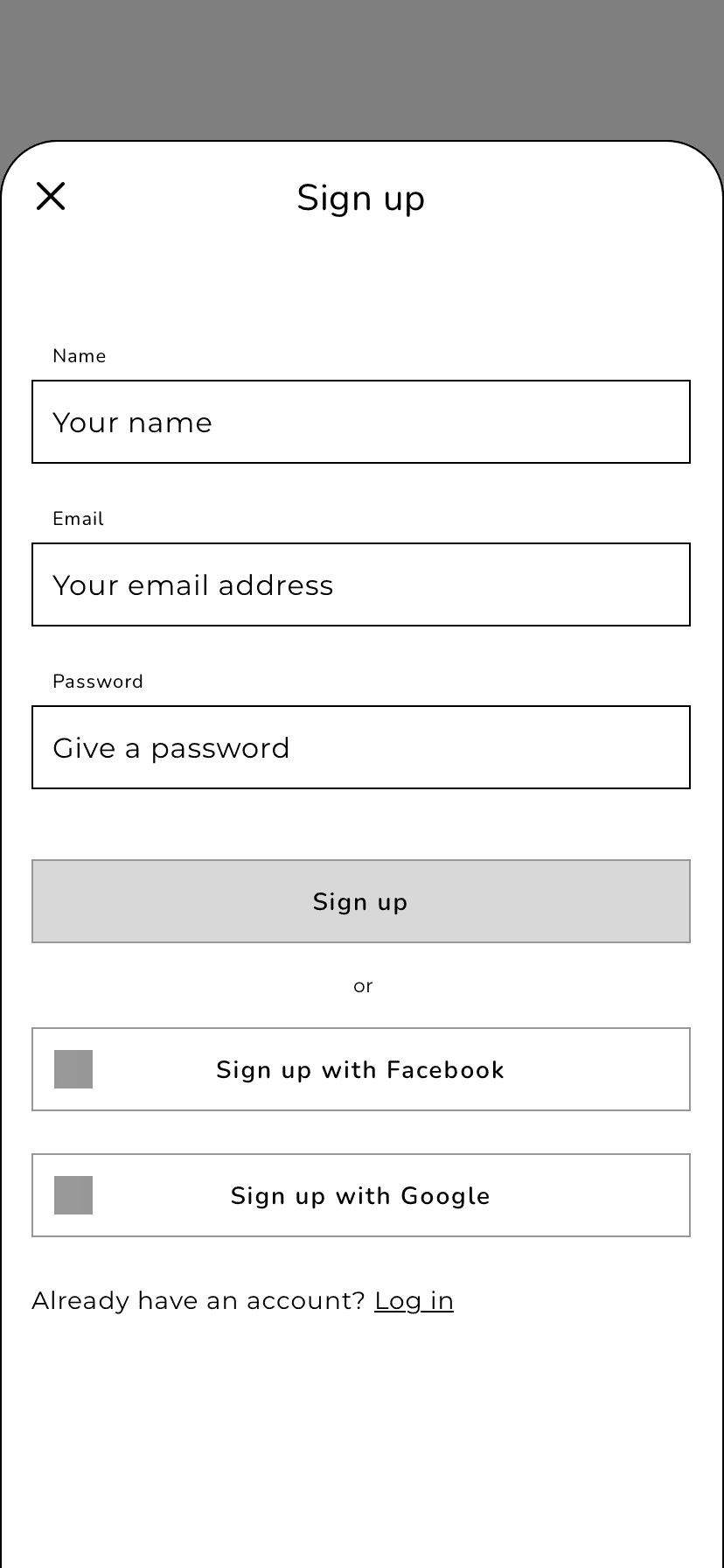
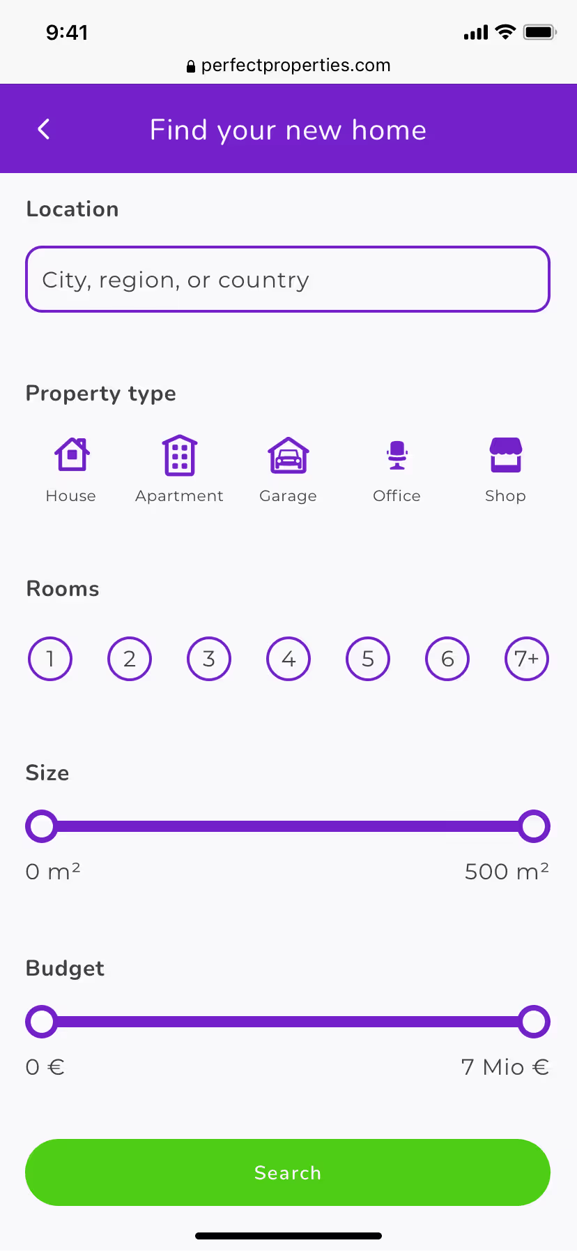
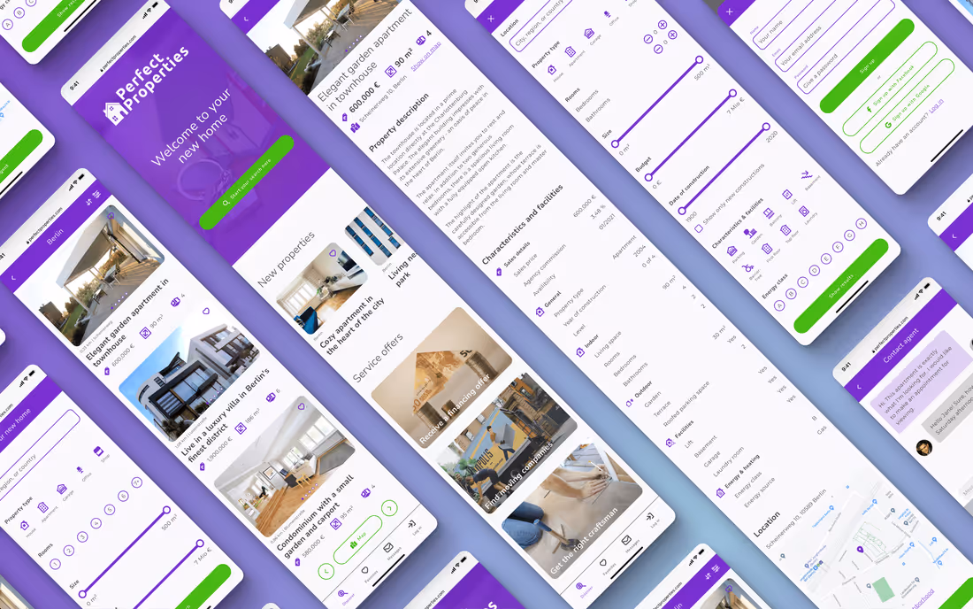
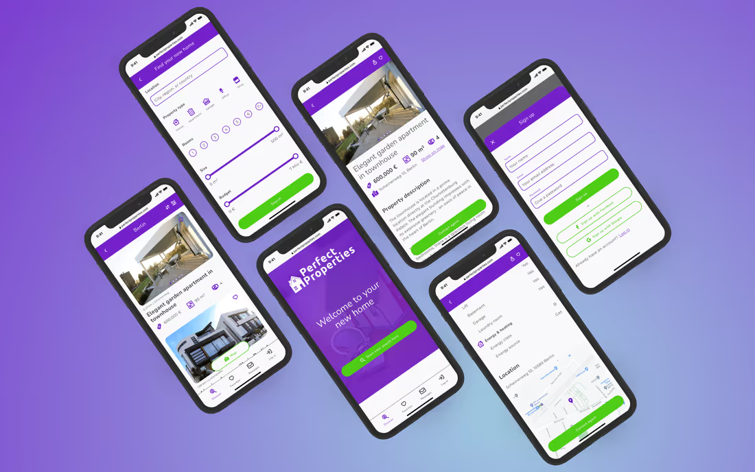
For this project, I focused on the core feature of this web app, finding properties and contacting the seller. To do this, I first created a user flow for our persona Rashida based on the following user stories from the project brief.
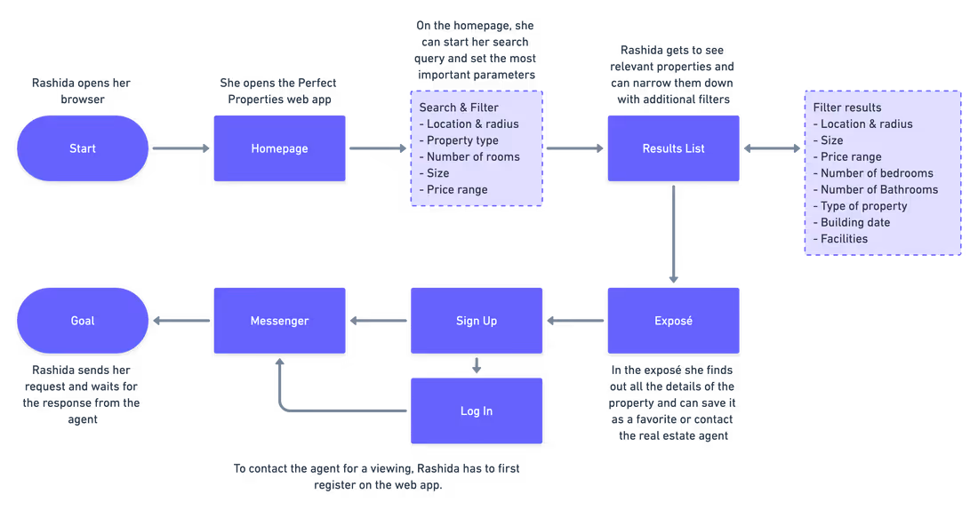
Thus, before creating the first sketches, I was able to determine which screens with which features were needed to ensure that the user’s search was fast and efficient.
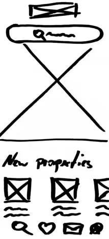
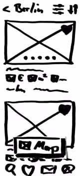
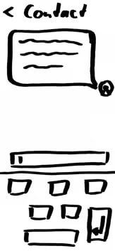
With the user flow I have mapped the shortest way to contact an agent. I roughly sketched the necessary screens in hand-drawn sketches and played around with a few ideas. According to the project brief the style should be clean. I tried to take this into account and chose a tidy and simple interface.
To visualize the user flow, I created a first, simple clickable prototype based on these sketches. Possible flaws in the flow or design could thus already be identified in this early phase of the project.
View prototype >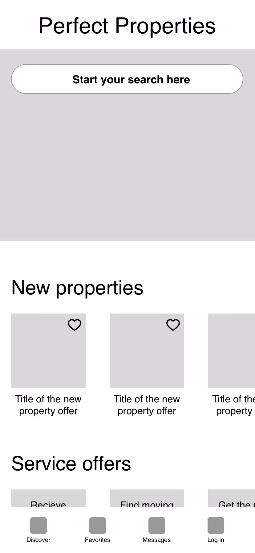
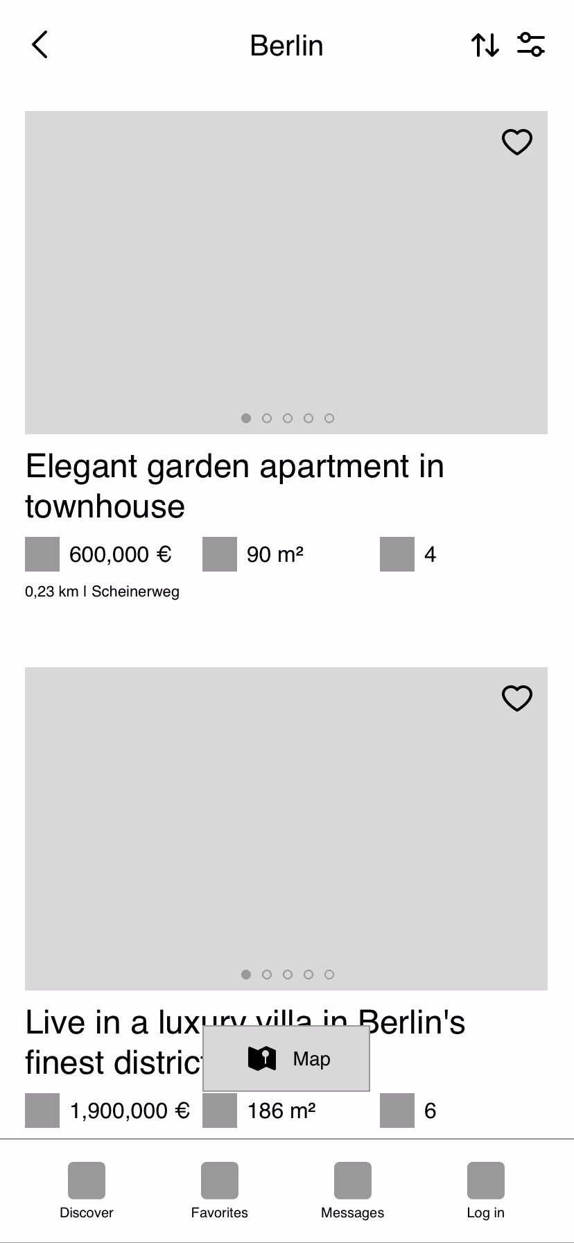
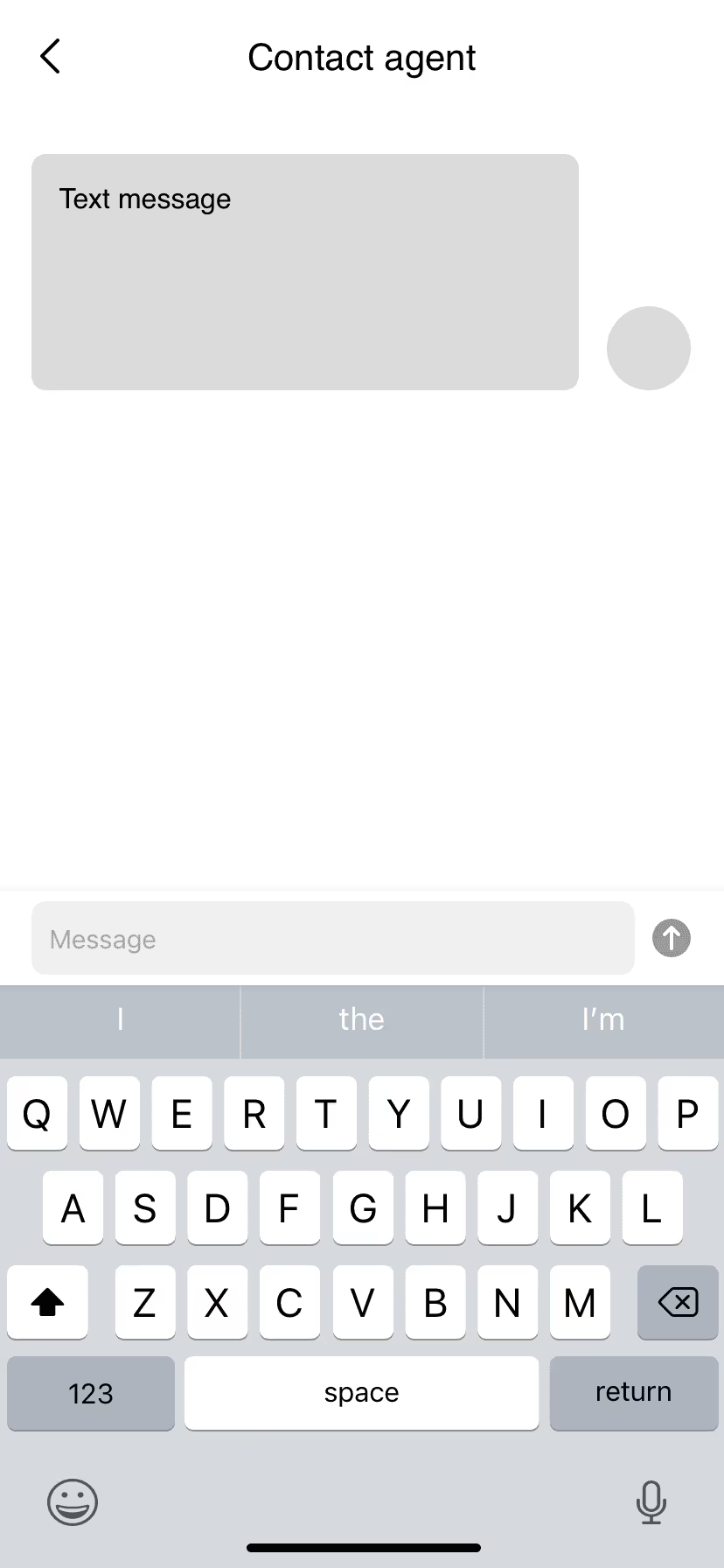
I then used the sketches to build grayscale wireframes in Sketch, adapting the content to a 12-column layout.
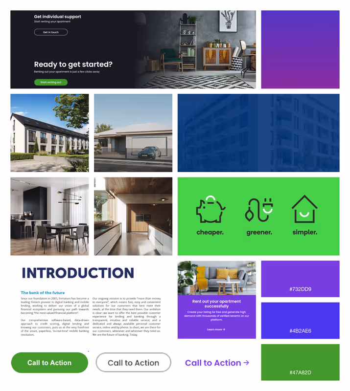
To set the right atmosphere for Perfect Properties, I created a mood board that uses sans serif fonts, outlined icons, and intense, vibrant colors. This emphasizes the clean, quick, and smart style called for in the project brief. The resulting mood is clear and inviting, the content quick and easy to grasp.
I was looking for a simple, clean font that conveys the mood of the mood board and is easy to read on screens. For this, the only option was a sans serif font. My choice fell on Montserrat. It is easy to read and looks light and modern, as the letters are wide and give themselves plenty of room to breathe.
I paired the font with Nunito for the headlines. This font looks a little smarter with its rounded strokes and fits very well in combination with Montserrat.
According to the project brief and mood board, I experimented with rather bright shades of purple, blue, and green for the web app. I wanted the design to be clean, quick and smart, which is why I kept the color palette to a minimum.
My choice for the primary color fell on a purple that looks lively and exclusive, yet inviting and warm, just like a new home should feel.

The green as the corresponding split complementary color is used for CTAs to make them stand out and quickly recognizable. This looks harmonious yet exciting and smart, and should allow the user to move quickly through the real estate buying process. I chose a gray tone for the font and a white tone for the background, each according to the primary color.
Perfect Properties’ design uses a lot of icons. In order to match them to the specific need, I created a set of 34 individual self-made icons. For the design of the icons, I was inspired by the font Nunito and its round shapes.
Now it was also time to breathe more life into my wireframes by adding some photos. To emphasize the smart and inviting style of the website, I chose bright, well-lit images with a minimalistic, quickly graspable content that create a comfortable feel-good atmosphere.
To document my previous design decisions and ensure a consistent look, I created a visual style guide.
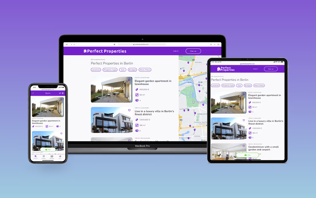
When designing the web app, I followed the mobile-first approach. Now it was time to adapt the website to different screen sizes. To do so, I set the breakpoints for tablet and desktop, following the Bootstrap recommendation:
I then adjusted the layout grids for the breakpoints and optimized the content for the larger resolutions.
This project allowed me to focus entirely on design and learn the main design principles. In particular, I was able to familiarize myself with the software Sketch.
There were moments that were difficult for me at first, like creating the mood boards or choosing fonts and colors from so many different options. However, those were probably also the moments where I learned the most about the benefits and possible approaches to overcoming those stumbling blocks.
I especially enjoyed the creation of the handmade icons. At first, I thought I would never finish them because of the sheer number of them. But once I figured out how best to work with vector graphics, it was a lot of fun and gave me a chance to sink into creating them and relax at the same time.
