Tools
Adobe XD
Google Forms
Miro
Whimsical
Technologies & Methodologies
Design Thinking
User survey
User interviews
Task analysis
User flow
Personas
Wireframing
Usability testing
Affinity mapping
Prototyping
Interface design
WCAG 2
This project was developed during my training as a UX designer at CareerFoundry. The objective was to enable people to get in contact with an expert quickly and easily. The exact choice of the topic and its elaboration was up to me.
Product designer
16 weeks
First of all, I had to choose a topic where people needed expert advice. And what was more obvious for a career changer than career counseling? But what is the problem that my app was supposed to solve? I first thought about possible problems with career advice and came to the following considerations.
To break down these considerations to a solvable task, I created the following problem statement.
Young professionals need a way to get career advice from an industry expert of a specific field because they do not have access to these experts within their network.
This problem statement had to be verified through intensive user research.
However, I still knew far too little about my target audience and had to get to know them better first. For my research, I had set myself the following goals:
So I was looking for people who already received career advice or at least have looked for an advisor before. From their first-hand experience, I hoped to gain extensive knowledge about difficulties in selecting an advisor.
Finding participants with the required experience in career advice was the most difficult part. I first searched in my circle of friends and my fellow students. But people seem to have high inhibitions, prejudices, or other concerns about this topic. I have used various social media platforms like LinkedIn or Facebook and extended my network to finally find participants.
At first, I was not sure in which direction I should go with the user interviews. More on the expectations and requirements of advisors and consultancy or more on the process of searching and decision-making? To determine this and to be able to design my interview questions more specifically, I decided to conduct an online survey beforehand.
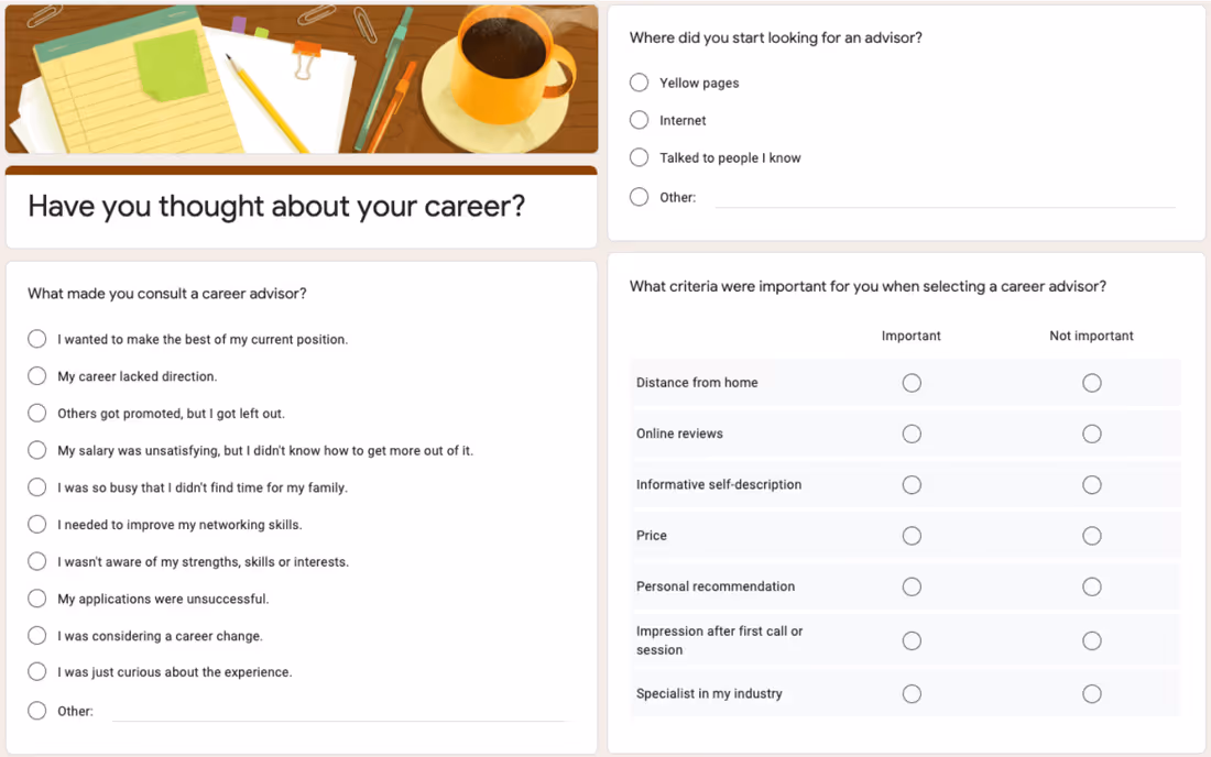
I was hoping to gain a first brief impression of the entire process of finding an advisor from as many people in the target audience as possible.
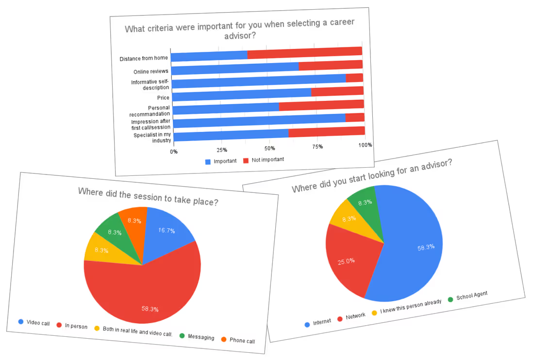
12 persons, who had already received career advice, answered the survey. I learned, for example, that most people had contacted their future advisor by email or phone, and that about 60% of the sessions took place in person. In the interviews, I wanted to find out more about this and find out whether these ways of contacting and conducting sessions were also desired by the people seeking advice, or whether they were only chosen because there were no other alternatives.
After the survey, I now knew what happened during the search for an advisor, but I didn't know why some things happened and whether people were satisfied with it or not. I wanted to deepen and clarify this by interviewing users.
I recruited people from my extended personal network and that of my fellow students and eventually conducted five user interviews, some in person, some remotely. I wanted to understand
I used affinity mapping to organize and categorize the findings from the interviews and to gain a deeper understanding of them. I reviewed all my notes and records for important findings and stuck them as sticky notes on a digital whiteboard using one color for each interview participant.
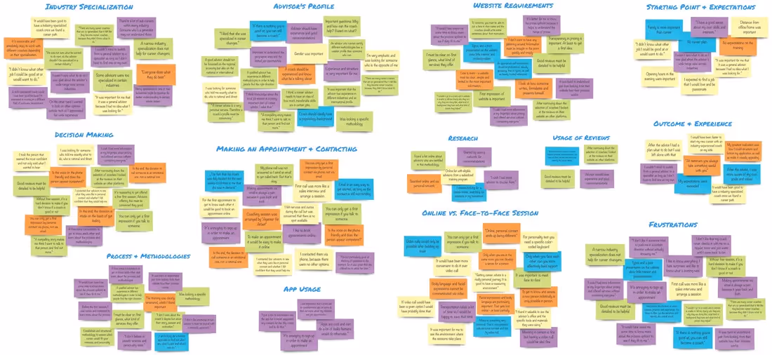
I found out that
It turned out that my initial statement
Young professionals need a way to get career advice from an industry expert of a specific field because they do not have access to these experts within their network.
was no longer valid. It became clear that such expertise is not in demand. Instead, I decided to focus on career changers and on providing them with fast and best possible support in this exciting and at the same time uncertain time. According to the findings of the affinity mapping, I revised the problem statement as follows:
Career changers need a way to easily get connected with an experienced advisor because the process of searching, contacting, and selecting an advisor is too complex and time-consuming.
In order to generate a user-centered and at the same time research-based design, I created user personas from the collected data and insights gained from the interviews. These are supposed to represent the majority of my target audience and visually communicate the findings of the research.
To do this, I took another close look at the user feedback and put it into the context of the categories I created during the affinity mapping. Thereby two groups of users emerged. One group was undecided and open to new things, the other more focused and controlling. This I incorporated into the personality of the two design personas.

On the one hand, we have Benedikt, a young architect who is spontaneous and relies on his gut feeling. He wants to change his profession but does not yet know in which direction. For him, sympathy and passion for helping are the key factors for successful advice. Ben trusts the comments and opinions of others and uses them to get a better picture of the advisor's personality.
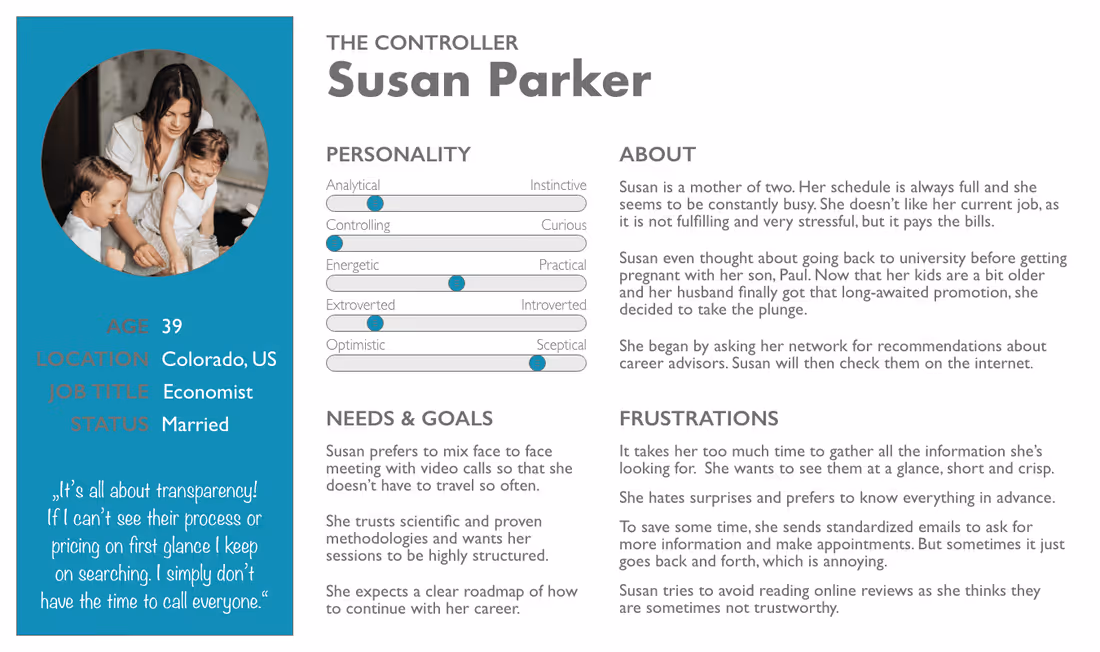
On the other hand, there is Susan. She lacks time, she is a wife and mother of two in addition to her job. She finds long searches for information a waste of time, which is unfortunately necessary because Susan is extremely analytical and controlling. She does not like to be surprised but prefers to be prepared in the best possible way. It is therefore especially important to her that information is presented transparently and can be grasped at a glance. She is looking for an advisor with a scientific approach and a clear systematic process.
To the different challenges and requirements that personas face when looking for an advisor, I outlined first possible solutions for the web app.
Susan doesn't like to receive information about price and availability only on-demand Susan finds a lot of advisors in the web app without having to research on several websites. The app serves as a database for advisors, where the booking process and the price is standardized and also the advisor profiles have a consistent layout to increase comparability. The consulting process, the expected consulting duration, the fees, and free appointments are displayed openly and transparently.
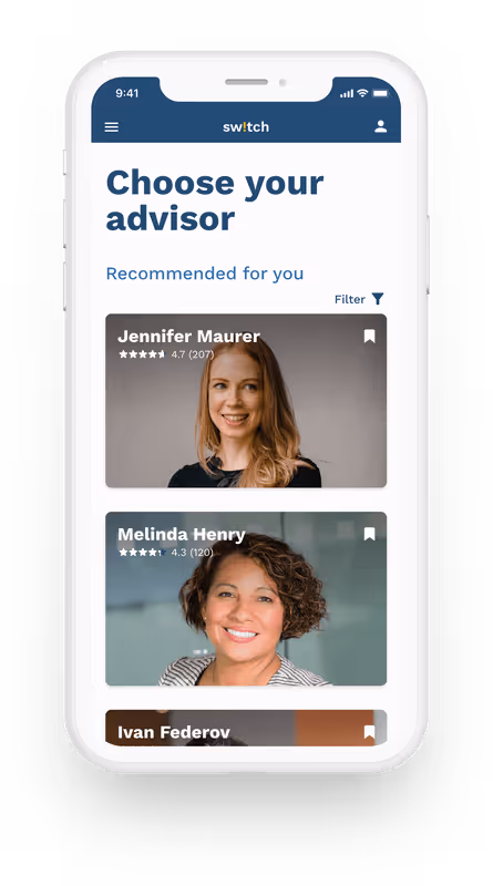
With a questionnaire at the beginning of the advisor search, Ben's personality and needs are determined and compared with the advisor database. Based on this, two or three advisors best suited to him can be recommended. This saves him a long time searching.
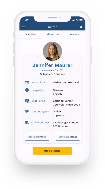
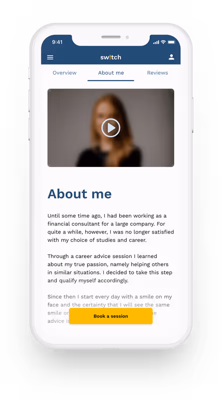
In addition, all advisor profiles contain a photo and a personal description as well as a short introduction video, which gives Ben a better impression of the advisor.
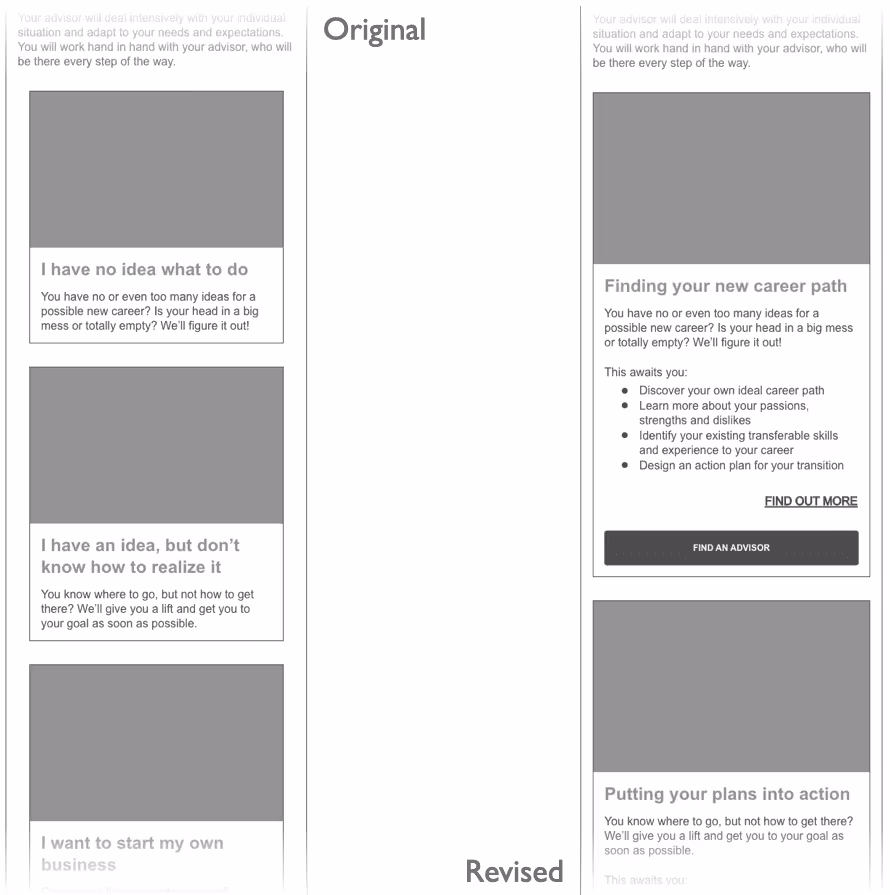
Since every career changer has different needs and goals, several different service packages are offered from which Susan can choose depending on her individual situation, e.g. Find a new direction, Job search help, Start a business.
On the homepage and the service description page, the most important information such as how it works, the duration, and content of the consultation are presented. Perhaps in form of an FAQ.
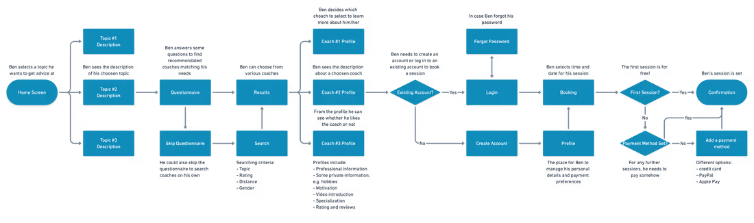
But before turning these ideas into wireframes, I wanted to determine how users would interact with the app, what screens would be needed, and how the solutions I developed would help. To do so, I created user flows for the personas. I first asked myself how these two personas with their different personalities, needs, and goals would interact with the web app.
We already know their goals and the motivation behind them: Ben wants to find sympathetic advisors who fit his personality. He decides from his gut and looks for an advisor who would be a good match for him. For Susan, on the other hand, informing is the top priority. Before she is ready to get in touch with an advisor, she first wants to know exactly and transparently how the app works, in which life situations it can help her, and how a session is conducted.
To build the user flow I first performed a task analysis.
Answering these questions and expressing them in a task flow allowed me to derive an effective and user-centered user flow.
However, I still knew far too little about my target audience and had to get to know them better first. For my research, I had set myself the following goals:
So I was looking for people who already received career advice or at least have looked for an advisor before. From their first-hand experience, I hoped to gain extensive knowledge about difficulties in selecting an advisor.
Finding participants with the required experience in career advice was the most difficult part. I first searched in my circle of friends and my fellow students. But people seem to have high inhibitions, prejudices, or other concerns about this topic. I have used various social media platforms like LinkedIn or Facebook and extended my network to finally find participants.
At first, I was not sure in which direction I should go with the user interviews. More on the expectations and requirements of advisors and consultancy or more on the process of searching and decision-making? To determine this and to be able to design my interview questions more specifically, I decided to conduct an online survey beforehand.
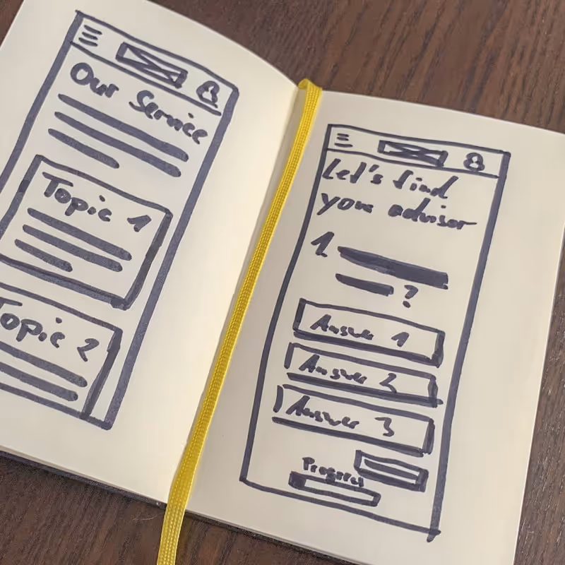
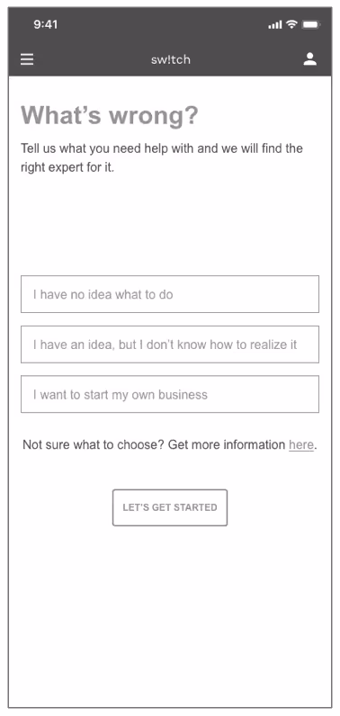
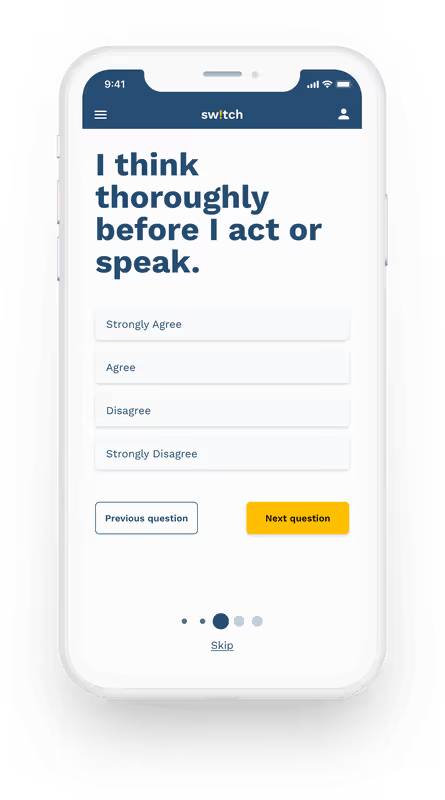
I started this phase of the process with some hand-drawn sketches. By creating low-fidelity wireframes, I was able to sort my multitude of ideas, put them on paper, and play around with variations of them to find the best solution.
I started to sketch first drafts for both mobile and desktop. Based on my user flows I developed the following features for the app.
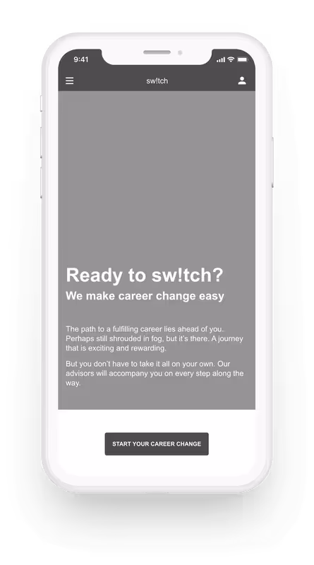
I transferred the rough sketches to Adobe XD, refined it, and added the copy. Following a mobile-first approach, I hereby focused on the mobile version.
I noticed that some of my wireframes in the digital version did not look like I imagined on paper. Only now it became clear to me how much or little space some components really needed. To achieve a consistent and user-friendly result, I did a few more iterations.
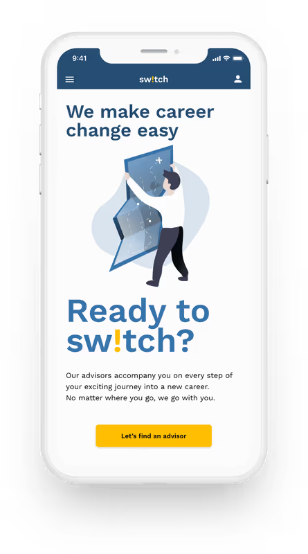
During this phase, the name of the web app was created: sw!tch. On the one hand, the name refers to the offered service: to switch careers. This should be reinforced by the upside-down i. On the other hand, both the name and the exclamation mark in the name are to be understood as an appeal to the users to start their career change now and not to wait any longer.
I optimized the wireframes in terms of readability, contrast, and spacing and converted them into grayscale high-fidelity wireframes. From these wireframes, I then created a clickable prototype to test sw!tch and its features on users for the first time.
Now the time had come to put my prototype to test with real users. But before that, I first created a usability test plan to outline the scope, goals, and logistical details of the test session.
The goal of this study was to assess the learnability for new users interacting with the career advice platform for the first time on mobile. I wanted to observe if users understand the app, its value, and how to complete basic initial functions such as searching for an advisor or booking the first session.
The study was conducted as moderated, partly in-person, partly as remote tests with 6 participants from my personal network, that match the personas’ profile.
In order to obtain comparable results, I created a script with tasks for the participants to perform to verify my objectives. The focus of the tests was to find usability errors in order to be able to correct them. I recorded the sessions to concentrate on the test and the participant and evaluated them afterward using an affinity map once again.
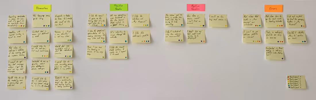
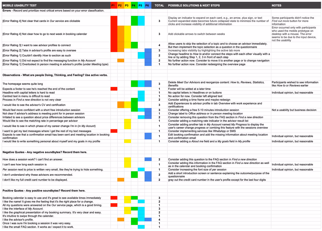
For a better overview, I collected the test results in a rainbow spreadsheet and classified the impact of an error according to Jakob Nielsen's Severity Ratings for Usability Problems.
In general, it can be said that the prototype was well received by the testers. Most of their questions about the process were answered and the feature of getting advisors recommended based on the questionnaire made their search easier.
However, not all errors required immediate fixing in my estimation, either because their impact on usability was minor and it was more of a cosmetic problem or because the error frequency was very low. Since not all issues from the usability tests could be fixed immediately, I concentrated on the five most serious errors or observations for the following design iteration.
Suggested Change
The current expanded state becomes the future collapsed state to minimize the number of clicks and increase the visibility of additional information. This makes the CTAs immediately visible.
Evidence
50% of the participants could not complete the task of finding an advisor because they did not realize that the cards were clickable. Another participant had difficulties but found out for herself.
Suggested Change
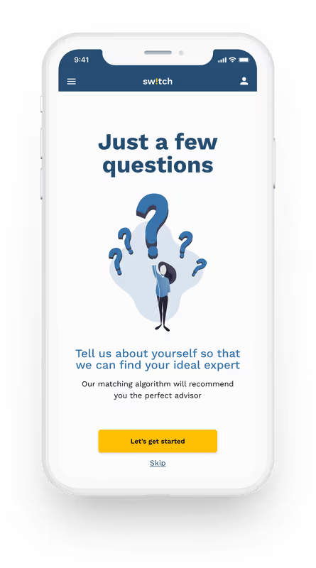
The first CTA on the homepage leads directly to the questionnaire. A question is added to the questionnaire to help identify the problem. If the user starts the questionnaire via the details page in the Our service section, this question is omitted as the topic has already been selected.
Evidence
Four participants wanted to directly see an overview of advisors without selecting a consulting topic first. Using Our service seemed to unnecessarily complicate the booking process for these participants.
Suggested Change
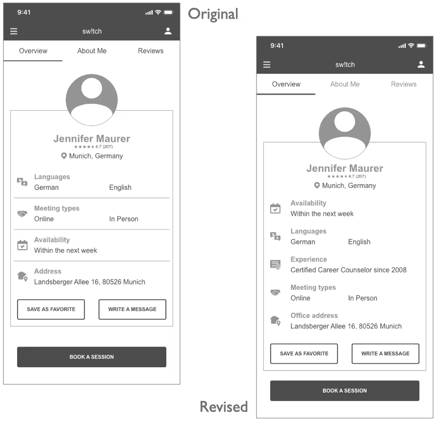
Increase the visibility of tabs by further highlighting the active tab. Add Experience to advisor profile in tab Overview with work experience and certifications. Change label of Address to Office address.
Evidence
Half of the participants only noticed the tabs at a second glance or not at all. Also half lacked information on the experience of the advisors and P6 was not sure whether the address given was the meeting point or residence of the advisor.
Suggested Change
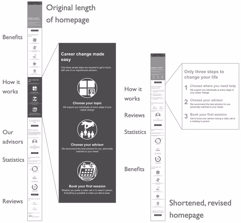
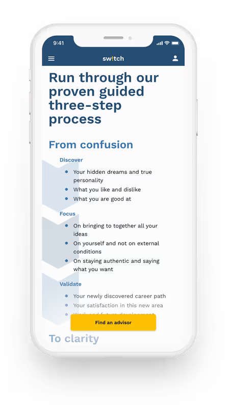
Delete Meet Our Advisors and reorganize content: How it works, Reviews, Statistics, Benefits. Change the headline of how it works section to Only three steps to change your life and connect the steps with each other visually by adding 1, 2, 3 in front of each step.
Evidence
50% of the participants wished to see information like How it works or Reviews earlier. P5 and P6 couldn’t identify how it works section as such.
Suggested Change
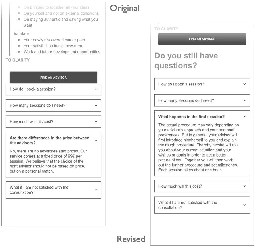
Replacing the question Are there differences in the price between the advisors? (as this caused confusion) with What happens in the first session? in the FAQ section of the Find a new direction page. This change could increase the probability that users will book their first session.
Evidence
Two participants pointed out that they could not find any information about the course of the session, but that they would like to prepare for the first session or want to know more about the general course of the session.
After the most serious errors have been detected with the usability tests and the usability and ease of use had been ensured, it was time to polish the look of the web app and bring it to life.
As a first step, I arranged the content according to the Gestalt principles and applied basic visual design principles. This helped me to shape the app's visual design.
Next, I applied color to help communicate the message of sw!tch to the clients. In order to create an appropriate atmosphere for a career change consulting service, I chose blue as the primary color to convey trust and professionalism. In contrast, the primary CTAs are in amber to signal energy, commitment, and trust.
In order to ensure that the product speaks a consistent language to the clients, a number of design guidelines are required that need to be followed. Therefore, I created a comprehensive design language.
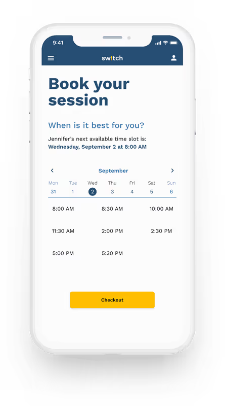
Go ahead, try the final product of this project yourself. Why not book your first session with a career advisor?
This project was my first experience with UX and design principles. It was a great and fulfilling experience. I learned and applied various techniques and tools during the course. And I must confess that I am very satisfied with the result.
Apart from the suggested improvements by my tutor, mentor, or fellow students, the feedback from potential users was most helpful. Be it in surveys and interviews, usability and preference tests, or even card sorting, user feedback has always given me the most insights and ensured that I am developing the app in the right direction with my iterations.
Of course, there were some stumbling blocks that I would avoid next time.
